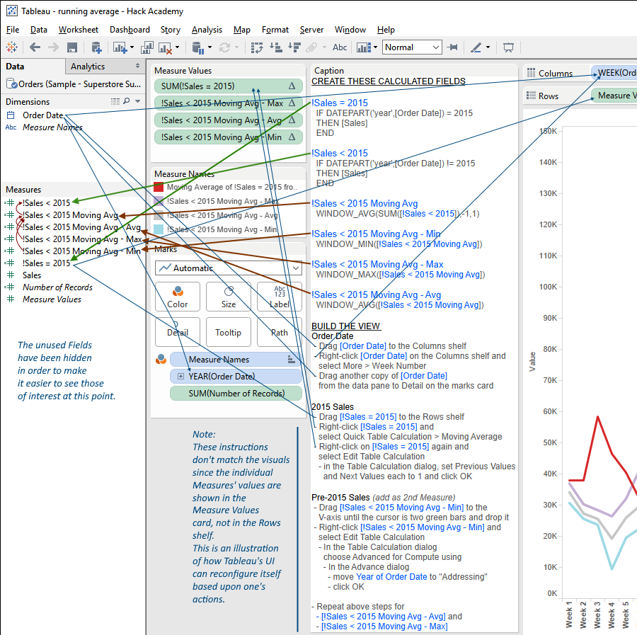
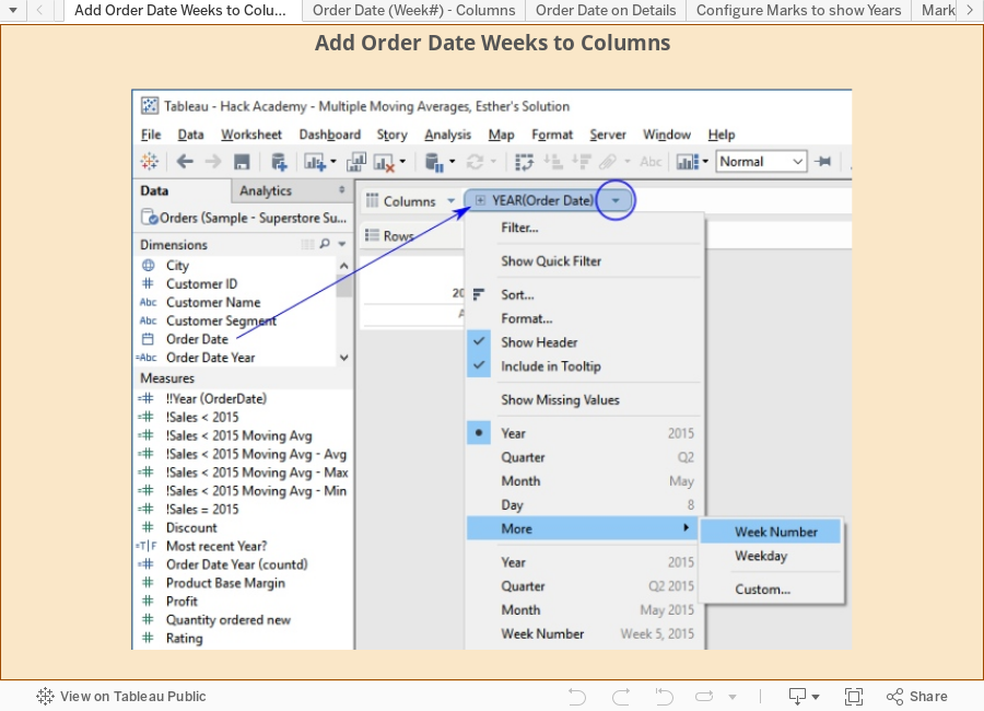
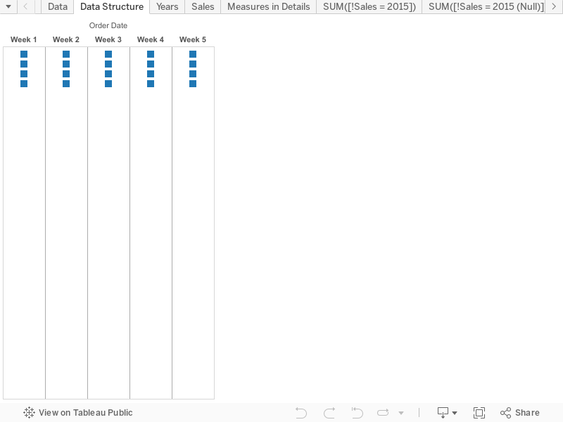
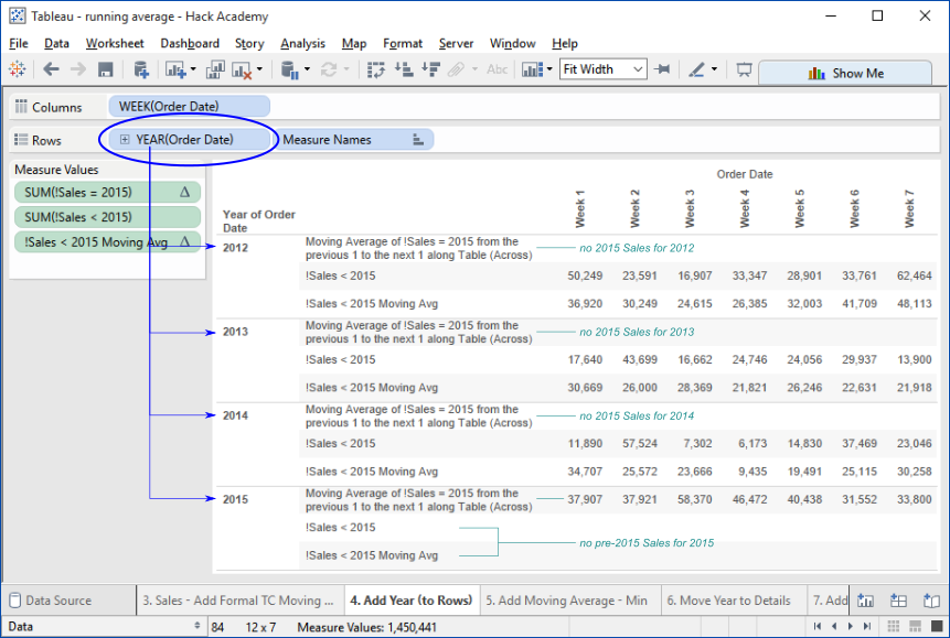
Wednesday, February 27, 2019

Calculations Complaints

This is a quick and dirty post of my reactions as I work through the Top 15 LOD Expressions on Tableau's site. Not much, if any, of it is news.

Calculation Composer

The Calculation composer is extremely primitive, any decent text editor is more capable than it is.
  1. It's missing auto completion, any decent text editor has better abilities.
  2. The formula reference gets lost when one is editing the formula contents, exactly when it's needed most.
  3. The formula descriptions and examples are generally not as good as they could be, are quite poor in some cases, leaving out relevant information, e.g. just what are the allowable datepart parts?
  4. applying the FIXED/INCLUDE/EXCLUDE formulas to an existing field in the editor provides an opening { but not a closing one, nor does it provide the essential ':' the User needs to know how LOD calcs work in order to complete the formula, which is particularly difficult given #2.

LOD Calculations

Working through the Top 15 LOD Expressions on Tableau's site:
  1. The Workbooks are Tableau version 9.0, they'd be more useful (at least less distracting) if they were kept up to date with Tableau's current version.
  2. The data used for the examples is not explicitly identified.
  3. The data used isn't the same for the various example, making it difficult to keep track of.
  4. The data is old, covers years 2010-2013 in one source, 2011-2014 in another, which doesn't provide any confidence that the information is important enough to keep up to date.
  5. The different time periods for Sales data - two different year ranges above, causes confusion; even if the reader isn't aware of it there's a cognitive dissonance that impedes learning the fundamental material.


Friday, November 30, 2018

Tableau's Lost The Helping-People Path

This post is a continuation of a discussion about Tableau's seeming reluctance to improve the product's ease of use.


...

It might be obvious, but I'm also disappointed that Tableau has effectively abandoned ease of analysis as a primary product principle. My list is only a mere scuff on the onion skin of things that would make Tableau a much better product. Some of them are so simple and easily fixed that their persistence is irritating—it's almost as if Tableau doesn't take the things that bug mere humans seriously. I know this isn't totally true; there are people at Tableau who really do care about these things, which makes the situation more mysterious and, oddly, more vexing.

At its core, the things that Tableau makes really easy to use for analyzing one's data are the handful of operational functions—field selection, sorting, aggregation, calculating new fields, and filtering—that 4GLs made easy in the 1970s, albeit in a mainframe character-mode terminal and line printer world.

Tableau extends this model by providing visual forms appropriate to the analytical context and makes it easy to apply visual characteristics, e.g. colors; although it's always been poor at clarifying its operating principles, e.g. why does the order of double-clicking fields produce different effects.

That pretty much covers Tableau's "best-ever" space.

There are a number of dead simple things that could make Tableau better even in this space, e.g.

  • Getting rid of the default cells' 'Abc' label – it's pretty silly, since the by far dominant purpose of the cell is to contain quantities, and the 'Abc' implies that text is the normal content. Even '123' would be preferable, although it's not without problems.
  • Adding scrolling to the dimensions' part of the viz – the 'Ideas' topic that prompted this discussion.

There's a vast space for improvements in expanding the functional easy-to-do analytical operations horizon: making more things simple, easy, and straightforward.

I spent a lot of time trying to get Tableau to hire me to help, and gave up when they were pointedly not interested.

It seems pretty clear that Tableau's been working very hard to make itself into an enterprise platform - there's a Motley Fool interview with Christian Chabot from a number of years ago (can't quickly find it) where he talks about Tableau's objective being to maximize its market potential in the context of enterprise platform software sales. This has never been a secret. Even as a new company Tableau used an enterprise sales approach: when I bought my Tableau license (money well spent) in 2006 I had to purchase it from an actual salesman who was primarily interested in how many other copies he could sell into the organization I was part of.

Bald-faced self-promotion here.

A couple of years ago I took the opportunity to put together a product proposal and some initial prototypes for a visual data analysis tool targeted at individuals with data they need to understand.

It addresses Tableau's shortcomings, with the advantage of over thirty years' experience in helping people with their data analysis needs—including stints as Product Manager for PC/FOCUS and FOCUS for Unix where we created the first generation of visual data analysis tools (alas, IBI did what Tableau's doing and looked to be more 'technology' than 'human' oriented)

It took the better part of a year and I'm pretty pleased with the product concept and design. Sadly, I'm not part of the 'business' side of this business, and the limited pathways to the resources required to build a real, live tool I've had access to haven't proved fruitful.

So... I'm open to any opportunities to collaborate in creating the next great human-oriented data analysis tool. One that's affordable and makes it simple, easy, and straightforward for non-technical people to connect with and understand the data that matters to them.

Given that Tableau's history strongly suggests that it's not going to revisit its basics and improve its fundamental functionality, I'm waiting for the next great tool to arrive, one that addresses Tableau's friction points and expands the range of what's is simple and easy to do data-analytically.

In the meantime Tableau remains the best tool I've ever found for basic data sense-making and I'll keep happily using it.

Thursday, November 29, 2018

A list of ways in which Tableau can -should- be improved.

Tableau's in need of a reworking, a redesign of it's fundamental data analysis interactive model. The original design concept worked well in the original functional space, but it's been left languishing and is in real danger of becoming left behind by new innovators.

It's been quite a while since I've spend much time and effort into advocating for improvements to Tableau's support for ordinary humans' data-analytical abilities.

At this time I'd like to present a compilation of material I've previously published, augmented with a wee bit of explanatory information.

I'm motivated to do this because I hear whispers that Tableau is maybe taking a look at how they can improve things.


Here's a list of references to material describing some ways in which Tableau could be improved; it covers a pretty broad span, partly because everything's related, partly because it's worth taking advantage of every opportunity to advocate for making Tableau a better product for helping people see and understand their data.

Nuggets and Seeds
A compendium of thoughts and musings about data analysis, effective data-analytical software tools, and Tableau's position as a premier tool for helping people see and understand data.
Is Tableau in danger of becoming just another enterprise platform? I hope not and fear so.
January, 2016

Rethinking The Analysis Frame #1 - Row Folding
Directly related to improving Tableau's table(ish) abilities.
September, 2013

Precision Inputs Required In Addition To Analog Controls
Precise control of the geometries of the various structural elements, e.g. column width would go a long way to making Tableau better.
Related: make it possible to select and adjust multiple elements at once - the current select/fiddle/repeat interaction model is tedious, tiresome, boring, and error-prone.
November, 2013

Inconsistent Chart/Table Formatting
October, 2012

Towards Better Formatting - Notes on Alignment
Specifically about text alignment, it lays out a robust set of options for formatting and aligning text.
Related: text should be formattable wherever it appears, this includes field labels, where it would be incredibly valuable to have control over folding, new lines, etc.

Problematic Table Formatting When Deployed in Dashboard
July, 2013

Jittery Charts - Why They Dance and How to Stop Them
January, 2013

Failure to Identify -or- Who is that mystery measure?
May, 2013

From Chart White Space to (the need for) Architecture
General thoughts on the need to implement a coherent visual architecture underpinning Tableau's visualization space and data-analytical interactive functionality.
July, 2013

Enhanced Chart Design - Adding White Space to Bar Charts
Visually separating elements grouped by Dimension members makes it much easier to identify these groupings than Tableau's current identically-sized matrix layout paradigm.
July, 2013

Dual Axis Visibility Configuration Explained - Is Not What It Should Be
August, 2013 Dual axis charts' axes should be independently and rationally controllable. They're not.
While we're at it: axes should be top-level objects, not subordinate to Headers, which means that one needs to have the Header visible in order to manipulate the axis. Which is bad, but worse: one needs to know that's how to get to the axis, and that's an impediment for non experts.

Is it Transparency? Is it Opacity? Labeled one, works like the other.
A little thing, but important in that 1) it works contradictory to expectations (that it established), and 2) plants a seed of mistrust in Tableau (if it's wrong here, where else is it?)
December, 2013

Additional Improvement Opportunities

Needed: More File Names and Better Interaction
April, 2013

Tableau Needs a New Windowing Scheme
(a bookmark article)
Essentially, Tableau's current application UI is horribly constrained by the fixed configuration of its component windows/panels.
The UI architecture made a little sense when Tableau was initially introduced, a legacy of the project Poseidon UI, but it's been outmoded for a decade.
Modern application UIs are much more modular and flexible, letting one have the tools necessary for the job at hand readily available without opening, closing. collapsing, expanding structural, modal components. March, 2014
Speaking of modality: the mishmash of modal/non-modal sub-windows and dialogs is a mess. Wherever possible, dialogs need to be non-modal.

Monday, September 10, 2018

Documenting Dashboards and their Worksheets

Objective

Document the Dashboards, and the Worksheets they contain, in one or more Workbooks, making it possible to use Tableau to see things like this:

Tableau Tools make it simple and easy to accomplish this. All of your Workbook's Dashboards can be documented so that it's easy to see and understand where they are and the Worksheets they contain.

Tableau Tool – Recipe

  1. Prepare the ingredients – make sure that:
    1. Ruby is installed
    2. The Twb gem is installed
    3. The Ruby script analyzeDashboardSheets.rb is available
  2. Open a console / command / terminal session
    > _  
  3. Navigate to the directory or folder containing the Workbooks you want to document
    > cd {path to Workbooks}  
  4. Run analyzeDashboardSheets.rb
    > ruby '{path to Workbooks}\analyzeDashboardSheets.rb'  
  5. Examine the CSV file containing the information, normally
    > ./ttdoc/TwbDashboardSheets.csv  
    —preferably with Tableau

Why This Tool

Problem Addressed

One of the challenges faced with Tableau once it's been in use for a while is in understanding where things are and how they're related.

Information Requirements

Individual and organizational interests have a common set of information requirements that can be framed as questions about how Tableau's being used. Being able to get answers to these questions is essential to being able to understand what's been created with Tableau. The questions include:
  • Where's that Dashboard, in which Workbook or Workbooks?
  • How many versions are there of it?
  • What Worksheets does it contain?
  • Are the Worksheets the same in the different versions?
  • Which Dashboards does this Worksheet appear in?
Individuals and an Organization's Managers have concerns and responsibilities regarding the effective use of Tableau, covering the spectrum from individuals' dynamic data analysis to construction, delivery, and consumption of informative analytics via Dashboards. (recognizing that Dashboards aren't the only information delivery mechanism, this post is specific to them)
A normal working Tableau person can be involved with many, many Workbooks. It's not unusual for there to be hundreds, even into the thousands of Workbooks to be present in an Organization where Tableau's been in use for any length of time.
Individual Tableau User
Broadly speaking, there are two main uses of Tableau. Some people use it primarily for their own data analysis, some use it to create analytics for others to consume, with many or most people with some mixture of the two. As an individual, once you've created a number of Workbooks it can become difficult to remember which Workbook a Dashboard is in, or Workbooks if there are versions and copies of it.
Organization
Organizations have multiple people with interests that are well served by being able to identify the content of Tableau Workbooks, including those responsible for:
  • Intellectual Property Guardianship
  • Data & Analytics Governance
  • Analytics Management

Tableau Doesn't Help (Much)

Tableau provides very little assistance in helping answer these and related questions. If the Workbooks are published to Tableau Server or Tableau Online there are some views that provide partial information, but it's a very limited perspective lacking real analytical flexibility.

Solution: Documenting the Dashboards and Worksheets

This Tableau Tool will examine a collection of Workbooks and record the information about their Dashboards, and the Dashboards' Worksheets. By default the Workbooks will include all the normal and packaged Workbooks in the current directory/folder—this can be easily configured to include as many or as few Workbooks as desired.
The information is captured in a CSV file, making it analytically useful with Tableau (or other data analysis tool).

analyzeDashboardSheets.rb

is a Ruby script that accesses Workbooks, locates the Dashboards, their Worksheets, and records the information in a CSV file. It can be run as-is, and is available as a Gist from GitHub here.

analyzeDashboardSheets.rb – How to Use

Prerequisites

Ruby is installed

Ruby is available for all of the platforms that Tableau runs on. It's available by default on Macs, and is easily installed on Windows.

The twb gem is installed

normally via:
  > gem install twb

analyzeDashboardSheets.rb is available

at {path}\analyzeDashboardSheets.rb

The Workbooks to document are available

Normally and most conveniently collected into a single directory, they can be located in multiple directories identified with a set of file naming patterns details below
The directory contains the Workbooks to analyze — we're using the Tableau Sample Workbooks here

  > cd '{directory/folder containing the Workbooks}'
  > ...
  > dir *.t*
   Volume in drive C is Windows7_OS
   Volume Serial Number is F861-CE43

   Directory of {...}\Tableau Sample Workbooks

  09/06/2018  04:28 PM           627,531 Regional.twb
  09/05/2018  09:34 PM           605,080 Regional.twbx
  09/05/2018  09:34 PM         1,091,332 Superstore.twbx
  09/05/2018  09:34 PM           533,181 World Indicators.twbx
                 4 File(s)      2,857,124 bytes
                 0 Dir(s)             ... bytes free
  
Note: Regional.twb is a copy of the sample Regional.twbx Workbook that's been edited and saved as a normal .twb file.

run 'analyzeDashboardSheets.rb'

most commonly, from the terminal command line like so:

 > ...
 > ruby '{path}\analyzeDashboardSheets.rb'
 
As it runs analyzeDashboardSheets.rb provides information about its operation:

  
  Analyze Dashboard Sheets from Tableau Workbooks.
  
  Processing Workbooks matching: '["*.twb", "*.twbx"]'
  
       - Regional.twb
       - Regional.twbx
       - Superstore.twbx
       - World Indicators.twbx
  
  Analysis complete, found: 4 Workbooks
  
  For documentation and generated data see the following:
  - ./ttdoc/TwbDashboardSheets.csv    Workbooks, Dashboards, and their Worksheets
  
  
  That's all, folks.
  

The CSV file TwbDashboardSheets.csv can now be used to identify and analyze the Dashboards and Worksheets.

TwbDashboardWorksheets.twb

connects to the CSV file and has a number of starter Worksheets that provide basic information, including those shown above. It can be downloaded from GitHub as 'TwbDashboardWorksheets.twb.zip' from here.
Workbook notes:
  • Zipped: the Workbook is zipped simply have GitHub provide a download link to it instead of presenting it as an XML file. Unzip it to use it.
  • CSV file: The Workbook is configured to pick up the CSV file from the current directory.
    This is normally the ./ttdoc subdirectory of the directory from which analyzeDashboardSheets.rb was run.
    If the workbook is opened from this directory it will automatically find the CSV file, otherwise you'll need to point Tableau to it.
    When the Workbook is saved it will remember this location, so if you want to use the Workbook with another CSV file you will need to edit the data connection to identify the new file's location.

Configuration:

By default, analyzeDashboardSheets.rb analyzes all of the normal and packaged Workbooks in the current directory/folder.
It can be told to analyze any Workbooks of interest by providing their names on the command line, either as specific names or as one or more patterns that analyzeDashboardSheets.rb will use to locate matching Workbooks.

Identifying Workbooks by Names & Patterns

The analysis is conducted on Workbooks identified by name, which can be literal names, e.g. 'Regional.twbx'; or by patterns, e.g. '*.twb', which may contain replaceable parts of file names—wild card characters.
The default pattern has two parts: .twb,.twbx . This is equivalent to
ruby '{path}\analyzeDashboardSheets.rb' '.twb,.twbx' and is interpreted as two individual patterns:
  • *.twb     identifies files ending in '.twb' – normal Workbooks
  • *.twbx   identifies files ending in '.twbx' – packaged Workbooks
note: there's a comma separating the individual patterns, with no spces between them.
Other patterns can be provided to identify any Workbooks of interest. Some examples:
  • '*.twb'   – only the normal Workbooks in the current directory
  • '/*.twb,/*.twbx'   – all the Workbooks in the current and all subdirectories
  • '{path}/*.twb'   – all the normal Workbooks in the directories named by {path}; where {path} can be relative or absolute
note: it's not necessary to put the patterns in quotes; they'll be handled either way, but it may make things clearer in some circumstances.

Data notes:

The CSV file contains this header record:
Workbook,Workbook Dir,Modified,Dashboard,Worksheet,Hidden,Visible
identifying these fields:
Field Description
Workbook the Workbook's name
Workbook Dir the directory/folder the Workbook is in – useful when processing multiple directories that may contain Workbooks with the same name
Modified the Workbook's modification date
Dashboard the Dashboard's name
Worksheet the name of a Worksheet contained in the Dashboard
Hidden whether or not the Worksheet is hidden
Visible whether or not the Worksheet's visible (opposite of 'Hidden'

Getting Started

It's simpler and easier to get started than you may think. If you're using Windows getting Ruby installed is straightforward, Google "Ruby on Windows". Ruby is included on standard Mac installations, and Google is again your friend.
Installing the twb gem, grabbing and running analyzeDashboardSheets.rb takes only a few minutes.
Download the starter Workbook into the 'ttdoc' subdirectory, open it up and start exploring your Dashboards and their Worksheets.

Thursday, August 30, 2018

Tableau Online Locations & IP Addresses

From Tableau doc found here: Tableau Online IP addresses for data provider authorization

Host Name (Instance) Site Location IP Address or Range
10ax.online.tableau.com N. America 34.208.207.197
52.39.159.250
10ay.online.tableau.com N. America 34.218.129.202
52.40.235.24
10az.online.tableau.com N. America 34.218.83.207
52.37.252.60
us-east-1.online.tableau.com N. America 50.17.26.34
52.206.162.101
us-west-2b.online.tableau.com N. America 34.214.85.34
34.214.85.244
dub01.online.tableau.com EU 185.92.123.0/29
eu-west-1a.online.tableau.com EU 34.246.62.141
34.246.62.203

Saturday, August 18, 2018

Calculated Fields Analysis with Tableau Tools — getting started

It's pretty handy to be able to be able to see and analyze the Calculated Fields in your Workbooks without the tedious bother of manually inspecting them by opening up the Workbooks and looking at them one at a time. Even writing that sentence was boring.

Imagine how much better it would be to be able to use Tableau to see the Fields, all brought together so that they can be scanned, filtered, sorted, and otherwise freely investigated.

Here's a screen shot of a Tableau Worksheet showing the Calculated Fields from Tableau's Sample Workbooks.
Note: the data window and controls – shelves, filters, etc. have been hidden for clarity.

Tableau Tools makes it simple and easy to analyze the Calculated Fields in your Workbooks.

This post describes the basics of analyzing the Workbooks and accessing the generated CSV data files.

First Step — Parsing the Workbooks
analyzeCalculatedFields.rb
is a Ruby script that accesses Workbooks, locates the Calculated Fields, and records the information in CSV files.
It's self-contained, can be run as-is, and is available from GitHub here. Usage

Prerequisites:

  • Ruby is installed
  • The twb gem is installed - normally via
    
    > gem install twb
    
    
  • analyzeCalculatedFields.rb is available at {path}
  • The directory contains the Workbooks to analyze — we're using the Tableau Sample Workbooks here
    
     > dir *.t*
      Volume in drive...
      Volume Serial Number is...
    
       Directory of {path}\Tableau Sample Workbooks
    
      06/27/2018  10:32 PM           605,080 Regional.twbx
      06/27/2018  10:32 PM         1,091,332 Superstore.twbx
      06/27/2018  10:32 PM           533,181 World Indicators.twbx
                   3 File(s)      2,229,593 bytes
    
    
run analyzeCalculatedFields.rb most commonly, from the terminal command line like so:

  > ruby '{path}\analyzeCalculatedFields.rb'

As it runs analyzeCalculatedFields.rb provides information about its operation:

  Twb::Analysis::CalculatedFieldsAnalyzer
  Analyze Calculated Fields from Tableau Workbooks.


  Processing Workbooks matching: '["*.twb", "*.twbx"]'

         - Regional.twbx
         - Superstore.twbx
         - World Indicators.twbx


  Analysis complete, identified
    # of Workbooks            :     3
    # of Calculated Fields    :    43
    # of Referenced Fields    :    84

  For documentation and generated data see the following:

     - ./ttdoc/TwbCalculatedFieldFormulaLines.csv    Calculated fields and their formulas' individual lines.
     - ./ttdoc/TwbCalculatedFields.csv               Calculated fields and their formulas.
     - ./ttdoc/TwbCalculatedFieldsReferenced.csv     Calculated fields and the fields their formulas reference.


  That's all, folks.

The CSV files can now be used to identify the Calculated Fields, their Formulas, the fields they reference, the Workbooks and Data Sources they are from. The provided Tableau Workbook: 'Calculated Fields - Base Data.twbx' connects to each of the CSV files and has a starter Worksheet for each, downloadable from here.

Another view of the Worksheet shown above is here:
Note: the data controls have been restored to show the more familiar Tableau user interface.


Data notes:
  • As shown, formulas are available in two forms:
    • as single elements, with all lines combined, and
    • in their original lines as coded.
  • "Formula Line #" is used to order the lines into their correct order, it can be hidden for clarity.
  • The TwbCalculatedFieldFormulaLines data source is more generally useful than TwbCalculatedFields, although TwbCalculatedFields contains technical information about the calculated fields that is useful for advanced technical analysis.

Workbook notes:
  • The Workbook is configured to pick up the CSV files from the current directory; this will be hard wired to whichever directory the Data Sources are using when the Workbook is saved.
  • The Workbook is packaged simply to avoid GitHub from presenting it as XML text by default – this can be confusing to people who aren't aware of or used to seeing Workbooks as XML.

Recommendations It's simpler and easier to get started than you may think. If you're using Windows getting Ruby installed is straightforward, Google "Ruby on Windows". Ruby is included on standard Mac installations, and Google is again your friend. Installing the twb gem, grabbing and running analyzeCalculatedFields.rb takes only a few minutes. Download the starter Workbook into the 'ttdoc' subdirectory, open it up and start exploring your Calculated Fields. Coming soon. Future posts will expand upon using Tableau to explore the CSV data prepared so far, showing how to accomplish things such as how to trace where specific fields are used. We'll also go over the other documentation produced, including maps of the Calculated Fields' relationships to one another and to the Data Sources' database fields. Further on, other tools will be introduced, expanding the scope of how Tableau things can be related to one another, e.g. identifying which Dashboards contain data from specific databases, which makes it possible to assess the impact of database changes—something that Tableau doesn't natively support.

Monday, May 29, 2017

Another Step in Tableau's Evolution?

Tableau broke new ground when it was introduced. The best tool for simple, straightforward visual data analysis then, it remains unsurpassed in this space today, even as it's striving to be a player in the enterprise marketplace where, to paraphrase Christian Chabot, it can maximize its market potential.

Tableau always wanted to be more than a personal product. The early Polaris project at Stanford pursued the ability to visualize "large multi-dimensional databases [that] have become common in a variety of applications such as data warehousing and scientific computing." When introduced Tableau was a simple tool, but beautiful in its simple elegance, particularly compared to the options then available.

Even though it was predominantly useful only as a personal tool, when I bought my license in 2006 to use in my BI consulting work I had to purchase it from my assigned sales representative, who was keenly interested in leveraging my use of Tableau to penetrate my clients' organizations. And the price was exorbitant for a personal product in a world where Borland had introduced the model of highly functional low and moderately priced products that could be impulse-purchased.

Over the years Tableau added more features and functionality, often layering them on top of its base,  leveraging existing functionality rather than implementing new and better ways of doing things. Dashboards were a big step. Tableau Server arguably a bigger one. Always moving forward, Tableau addressed the concerns of "enterprise" people pointing out its shortcomings from their perspective.

The IPO was a big deal. It meant that Tableau had grown up in meaningful ways. Made it easier to raise capital and expand its visibility in the marketplace.

Making Gartner for the first time was huge. Now Tableau was visible to the top executives who look to Gartner to see what other top executives think, and Tableau was at a stroke a presence in the mindspace of enterprise business decision makers, a legitimate option for big corporate dollars to be spent on. Things were moving forward, life was good, especially for Tableau's founders and executives. They had made the world a better place, and reaped handsome rewards in return.

Then the haircut. The stock price dropped 50% in February, 2016. Moving into the enterprise marketplace was more difficult than disrupting a moribund personal tool space had been. Elegance and effectiveness of design had profoundly improved people's data-analytical lives in a burst, and Tableau became the darling of individual analysts. But big, serious, enterprise customers moved in response to a different set of forces. Conservative to the core, they needed to be convinced that Tableau could "be like" their existing heavily invested data processing tools and platforms. They didn't care that Tableau offered opportunities that could, if taken advantage of, dramatically change their entire approach to business data analysis, inverting it from a top-down industrial model to an organic model where the right data was available for use and analysis throughout the organization. Enterprise executives didn't want to do things better, they wanted to do the same things cheaper, and hopefully faster. Tableau announced that it was concentrating on high-value deals, with their longer lead times and associated complexity. The company that had succeeded because it sold individual licenses to people, making a difference in their lives, was now concentrating on big, impersonal deals. A different world indeed.

Tableau was in a vice. Its strengths had earned it a seat at the table, with a window of opportunity to demonstrate that it was an enterprise player like the big companies it had disrupted at the personal end of the spectrum. What to do?

Six months after the haircut Christian Chabot stepped aside as Tableau's leader after shepherding the company from frisky upstart to market leader, and then through the penetration of and acceptance in the enterprise market.

Tableau has been busy releasing new versions adding additional features that improve its enterprise offering. More data sources connected, more Server functionality, more stuff.

Tableau has not been busy improving its core ease of use, or of expanding the horizon of the things made simple and easy. It's almost as if Tableau believes that the 'low' end, the one where it stands out and is truly special, isn't the place to invest its time, energy, effort, and money.

Which brings is to the present, and the trigger of this post. According to reports Chris Stolte has sold of a bunch of Tableau stock, e.g.
  • Monday, May 15th, 75,000 shares at an average price of $61.69, for a total of $4,626,750
  • Monday, May 8th, 150,000 shares at an average price of $60.15, for a total of $9,022,500 
As of this information, Chris directly owns 78,805 shares valued at appx. $4,861,480

What does this mean? I have no idea. I don't know Chris, although I've met him a couple of times at Tableau functions.

But I'm worried. Worried that one of Tableau founders has stepped out of the direct line of effect, and another appears to be shedding himself of his investment in the company. Worried that Tableau is moving more purposefully towards concentrating on the enterprise market and maximizing its market potential, aka capitalization/shares value, and that this means that will move even farther from its roots as the best-ever tool for visual data analysis. Worried that the chances to revisit its core functionality, fill in the holes, correct the flaws, adjust the oddities, sand off the warts, improve its deficiencies, and extend its ease of use into new areas, are vanishing in the rear view mirror.

On the other hand, maybe Chris is looking for a new challenge. Maybe he's interesting in picking up again the mantle of champion of the visual analyst and work towards creating the next great visual data analytical tool, the one that is what Tableau could have become. If so, I've been working on some ideas.

Monday, September 26, 2016

Why no, Tableau, I don't want you reading my mail.

I was excited about being able to use Tableau with my Google sheets' data. The ability to connect directly to them with Tableau 10 was really appealing.

My enthusiasm dissipated quickly when this showed up:

Really, Tableau?
You want to view my email address and basic profile info?

What possible reason could there be for needing this information to establish a connection to my Google sheets? I can't think of a single one.

Whose idea was this?

Frankly, the whole thing is offensive, and I'm very put out.

Monday, July 11, 2016

On the virtues of simpler and easier.

"Creeping featurism is a disease, fatal if not treated promptly. There are some cures, but, as usual, the best approach is to practice preventative medicine."

— Donald Norman, The Design of Everyday Things 2002 Basic Books edition ISBN 0465067107 Ch. 6, p. 173.

"The best software for data analysis is the software you forget you're using. It's such a natural extension of your thinking process that you can use it without thinking about the mechanics."

Stephen Few on Data Visualization: 8 Core Principle

Tuesday, May 31, 2016

Please stop spamming the comments.

To those of you who submit comments with zero content other than soliciting for your Tableau training, consulting, or other commercial purposes: you might as well stop.

Your comments will not be published.

I find it offensive that you're spamming the comments, contributing nothing to the topic at hand but looking to advertise your wares.

It offends me personally in that I need to spend time attending to your crass, pushy, rudeness.

It offends those of us who have put in the time, energy, and effort to become competent professionals. Your pushing the idea that simply taking a short Tableau training course, of dubious quality, is enough to get someone to pay you to work with it is at best naive, misleading, and reflective of the race to the bottom that values a smear of exposure to real competence.

Examples of comments I will not publish:

Nice Article !!! Thanks for sharing with us !!! Visit - http://[spammer 1].in/

http://www.[spammer 2].com[...]tableau-online-training-in-[...]/

great post i read from start to end its awesome, keep on writing more about TABLEAU. we are one of the leading TABLEAU online trainers.. Visit - http://[spammer 1].in/

your blog is such a wonderful and nice library which filled with lot of technical stuff please share with us http://www.[spammer 3].com/tableau-training.html

Nice Article Thanks for sharing with us !!! Visit - http://[spammer 1].in/

This is a Good blog. Thank you for your very useful information. I appreciate that you looked it up to share with us all!.... Tableau online training on

Tuesday, May 3, 2016

Dashboard Improvement Opportunities - Surface Observations

Tableau Dashboards need improvements.

I've been beating the drum for improvements to Tableau's dashboards ever since they were introduced. As a way to get more than one worksheet into the same visual space they were adequate, and they still work OK/tolerably/nottoobad/betterthannothing, etc. for those situations where you only want to double-click 2, 3, or 4 worksheets and have Tableau put them into a grid-based layout.

But this isn't good enough.

Over the years I've been using Tableau there's been far too much time consumed with fiddling, faking, fooling, and futzing around with dashboards. Time that takes away from the real value of helping people discover, understand, and communicate useful and valuable information in the data that matters to them.

Yes, Tableau has made improvements to Dashboards and dashboard creation and maintenance. And some of these are really welcome, as far as they go. For example, the introduction of the Layout control in the Dashboard Window was a half-quantum leap forward. For the first time we could see, without use of external tools, how the elements in a Dashboard related structurally to one another. But as good as it was, as much a leap, it was still only a half-step forward: the Layout control is so small, and it's selection management abilities so poor, that using it is an exercise in multi-click hell. And it's still easier to get a comprehensive view of Dashboard contents with external tools.

It was at this point of describing my frustrations with a colleague who was relatively new to Tableau, and didn't have any experience in more sophisticated tools, that she said, in effect: "well, I don't see what's wrong with it, so why don't you show me?"

Hence the following diagram. I created a simple, two-sheet dashboard and used it to illustrate some of the problems that jumped out. It's in no way comprehensive—I tried to keep it relatively simple.

The Tableau Public published version of this workbook is here.

A concrete example. Have you ever been wrestling with a dashboard, trying to get things nicely organized and arranged, only to have Tableau seemingly go insane, moving things around that you haven't touched, making it difficult to place and resize things that only a moment ago were all nice and tidy? The following example shows one of the things that can contribute to the chaos.

Multiplying Containers.

Start with a newly created dashboard.

Then click "Show Title" 5 times,
i.e. issue this command sequence:

  1. Show Title
  2. Unshow Title
  3. Show Title
  4. Unshow Title
  5. Show Title


After all the Title Showing and Unshowing you should see that Tableau has gone ahead and created this container structure for you.

This is bad. But it gets worse—once a Dashboard is populated with actual (human) content Tableau will insert containers as you, the dashboard author, do your authoring. This can make for extremely messy situations.

Monday, January 11, 2016

Nuggets and Seeds

Preamble

This post presents a collection of thoughts covering some of the idea space I've developed over nearly ten years of using Tableau, largely framed within the context of its existence of a data analytical tool suitable for use in the modern enterprise.

There's no real intentional organization; although there are commonalities, themes, and overlaps, no narrative is intended. Some of the nuggets and seeds have been fleshed out to some degree in working notes, but not to the point where I'm comfortable publishing them. Part of the purpose of listing them here and now is to experiment, get them out and see if it helps stimulate generating a broader synthesis.

One of my motivations is that I've become increasingly concerned with the direction the field I've made my profession is taking. At heart I believe that data analysis should be part of everyone's intellectual toolbox, that being able to explore the data relevant to one's area of interest provides the opportunity to achieve a deeper and richer understanding of the state of things. We use tools to augment our intellect—our knowledge and expectations of our environments. Data analytical tools are, or should be, like other tools: providing useful functional features that maximize their usefulness while minimizing the concessions the person using it must make.


What's the Point? A Brief History of Computer-Assisted Data Analysis

– FORTRAN, COBOL, 4GLs (e.g. FOCUS, RAMIS, Nomad), {the dark ages}, ... Tableau, ...?
– terminals, line printers, GUIs, touch-sensitive surfaces, ?

Data Analysis is Not Just Visualization or,
Visualization Is (Only) The Thin Outer Layer of Analysis

"Visualization" is the currently popular term, used far and wide as the tag for the new wave of tools, technologies, and activities that provide the means to access and present data in a form that people can interpret and derive information from.

But it's misleading, a gross simplification that ignores the primary role context plays in forming and communicating data's information value.

"123.45" is a data visualization

just as much as is this bar, and "123.45" is more effective in communicating the quantity to boot

decimal notation using the Arabic-Hindu numerals is in this context a time-proven, highly effective method of visually representing numeric quantities to an arbitrary level of precision in a small space

thinking that quantitative data visualization is restricted to geometric forms is a handicap

Decision-Making Benefits From Analysis of Available Data Data Analysis is (or should be) a Cognitive and Intellectual Skill

supported as much as possible with tools and technologies that augment, not inhibit, or erect unnecessary barriers to human abilities

unfortunately, there are forces that continually work to shape data analysis as a primarily technical undertaking—these forces are to be resisted, but must be understood in order to be overcome

For Whom the Tool Toils

data analysis is for everyone, not just the executives at the top, or the line-of-business people on the surface

The Right Tool for the Job

there's no golden hammer

Why Only Tables?

Tableau can only access and analyze data in tabular form. (with the limited exception of cubes, which are infrequent targets for Tableau analysis, perhaps because Tableau's analytically retarded here)

To the best of my knowledge the decision to restrict analysis to tabular data has never been explained.
But, it's a severe limitation, and one that is difficult to understand.

Granted, at the time Tableau came into existence, and Polaris before it, organizing data had become the de facto norm. There are a lot or historical reasons for this, a discussion of them is beyond the scope of this post. But the truth is that table-based data organizing, even when Relational (and by far most real world systems aren't proper Relational models), is a terrible way to store data for human understanding (and I've had some people take real umbrage at this statement).

Historically, before tables became the norm, data was stored in structures that matched the information model the data was persisting information about.
Hierarchical databases were everywhere, and network databases weren't so rare as to be alien.
Even more relevant to this discussion, the 4GL data-analytical tools from the 1970s could understand these structures and analyze them correctly in context, providing the human-correct results.

In the present, the growth in the number of non-tabular data sources that people are interested in exceeds that of standard tabular sources. NoSQL, JSON, XML, YAML, and many other formats and structures have emerged and taken root.

Tableau's inability to recognize and analyze non-tabular data leaves a huge hole in the data analysis tool marketplace. Who's going to fill it?

No One Ever Got Fired For Quoting Gartner

Back in the way back, when IBM dominated the business automation universe, when mainframes ruled the roost the conventional wisdom held that "No one ever got fired for buying IBM".

There's a similar knee-jerk reflex conditioned into today's executive managers responsible for selecting strategic information technology for their organizations—they rely upon Gartner, particularly it's Magic Quadrant, and similar research firms to tell them which companies are positioned where in the marketplace. Many, too many, managers take these fora as trustworthy guides for their purchasing decisions, essentially abdicating some level of responsibility for conducting their own research into the technological space wherein may lie tools, products, etc that could be useful and valuable.
(the validity and shortcomings these market analyses is well documented and argued elsewhere)

Getting recognition in these fora is a huge leap up the food chain for vendors. Being identified as a viable product in the Magic Quadrant is a threshold event that exposes the vendor and product to the widest, deepest-pocketed audience/market in existence. Being recommended is a quantum leap forward. Which is all fine and good if one's trying to build one's company into the largest, most lucrative entity possible.

But.

Is it that what a truly innovative company interested in providing the best possible product that helps the greatest number of people should be striving for; to simply grow, and grow, and grow?

Just analyze it.

Many organizations that are trying to adopt Tableau as a BI tool or technology are going about it the wrong way. They're using Tableau in the traditional SDLC model, and are as a result missing the greatest part of the value Tableau offers.

Software isn't material, so there's little cost to trying something to see if it works. Experiments can occur almost at the speed of thought, dramatically closing the gap between conception and creation

The traditional approach of concept, analysis, design, build, deliver is mired in a model of work that's rooted in the industrial production paradigm that underlies modern business management theory and practice (I have a BBA and MBA). This model worked extremely well during the industrial age, when producing large numbers of physical goods was the organization's work. It's not only of little value in the non-physical world, it is actively detrimental to the good conduct of work that's predominately centered around fluid cognition and creation.

Tableau's Arc

Tableau has occupied a shifting position in the data analysis pantheon over the past decade. This is the story of my experience with it, the ways in which it's been employed, and its presence in the broader worlds in which its taken root.

Thinking About What Makes Good Data Analytical Tools looking to Bret Victor's Learnable Programming
...two thoughts about learning:
  • Programming is a way of thinking, not a rote skill. Learning about "for" loops is not learning to program, any more than learning about pencils is learning to draw.
  • People understand what they can see. If a programmer cannot see what a program is doing, she can't understand it.
Thus, the goals of a programming system should be:
  • to support and encourage powerful ways of thinking
  • to enable programmers to see and understand the execution of their programs

There's a lot to learn from these thoughts, directly relatable to using technology for data analysis. For example:

Data analysis is a way of thinking about the nature of things: their identities, quantities, measurements/metrics, and relationships to other things.

Learning about the technical properties of specific technical implementations of analytical operations is not learning about data analysis.

If people cannot see into the machine, it's very difficult to achieve a robust understanding of what the machine is doing, how it does it, how to imagine the things it can do, and how to set it up so that it does what one wants.

Design Rot: Tableau's Usability Has Stalled

For years, Apple followed user-centered design principles. Then something went wrong.
In their article How Apple Is Giving Design A Bad Name Don Norman and Bruce Tognazzini argue that Apple has abandoned the principles of usability in its product designs in favor of a beautiful aesthetic experience that hinders rather than helps users' ability to accomplish the things they want to.

In its own way, Tableau has similarly failed to continue to pursue the same elegant usability at its heart.

When Tableau appeared its design was revolutionary, providing simple, intuitive objects, and interactions with those objects, that surfaced data and fundamental data-analytical operations, very closely matching a the human view of a particular and useful analytical model.

This was Tableau's genius. For the first time people could -do- simple, basic data analysis with a tool that made it simple and easy.

Since then, Tableau hasn't followed through with its initial promise. The simple and easy things are still simple and easy, but pretty much everything else beyond this space is too complex, complicated, confusing, obscure, and unnecessarily hard to figure out.

The list of Tableau's design faux pas has become too large to catalog. At one time I had hopes that Tableau would recognize it had accumulated too much bad design and take steps to remedy the situation. I no longer believe this; Tableau appears to have invested so much into its current way of doing things, and reaped so many rewards for doing things the way it has, that there's no motivation or incentive for it to change its stripes.

Side Effects, Tips, Tricks, and Techniques: Useful Aids or (Un)Necessary Evils?

Does the need to learn, master, and employ these to accomplish useful analytical effects add or detract from Tableau's overall utility and value?

It's not a simple black or white situation, but there's an inverse relationship between the quantity and complexity of the technical things one needs to learn to accomplish useful things and overall utility. The more tricky things one needs to know, the harder the tool is to use from a human perspective, and the further from the primary goal one needs to work.

On the Consequences of the Exaltation of Complexity

what happens when mastery of arcane technical matters is elevated and praised above sense-making

Tableau's Salad Days

are the best behind us?

The Perils of Ossification

what happens when a tool freezes, welding into place aspects that could be improved through continual evolution

Suffering the Innovator's Dilemma
or,
The Rise and Fall of a Disruptive Innovator Beware the Cuckoo's Egg

considering the consequences when one tool pushes out others

Yes, You can do that in Tableau. So what?

just because it can be done, should it be?

Tableau is a terrific tool for accomplishing basic data analysis quickly and easily, and for communicating interesting findings, also quickly and easily.

There are, however, limitations in what Tableau does simply and easily, and more limitations in what Tableau can be coerced into doing. When faced with situations where needs fall outside Tableau's capabilities, or where the effort to satisfy the needs with Tableau exceeds the effort to satisfy them with another tool or technology, it's a good idea to at least entertain the notion that Tableau should not be used.

Velocity, Value, Volume Pervasive Data Analysis - a Promise As Yet Unfulfilled

it's been over thirty years since the idea of making analysis of one's own data possible and as seamless and easy as possible surfaced
there was a flourishing of the concept for a while; business people could analyze their data with minimal involvement and support from their data processing organizations, br /> but it didn't last

there was a decline
along with a dramatic increase in the size, wealth, and power of the database and BI platform vendors

a decade ago Tableau appeared, and made it possible for nontechnical people to access and conduct their own fundamental data analysis, achieving previously unthinkable insights immediately with little or no technical intervention or support—it was a revelation, and carried the hope that pervasive data analysis could become a reality

so... why haven't things progressed all that much in the ten years since?

Self-Service BI – it ain't what you think

Anecdote: Several years ago I was talking to a friend, a Senior Information Officer at The World Bank about Tableau's benefits, how it had the potential to change everything, describing how it could, if adopted effectively, be the path to helping 'ordinary' people obtain the insights and information from the data that mattered to them, much of which lay outside the boundaries of the Bank's institutional data hoard.

Her response was that they didn't need it, their needs were being satisfied through the self-service Business Objects environment they'd set up.
As it turned out, the BO solution didn't gain much traction.

Deliver Value Early and Often Do the Right First Thing First or,
Start With Data Analysis

it seems obvious, almost not not worth mentioning
but far too many BDA efforts ignore, or are ignorant of, the opportunity to start with data analysis, often in the mistaken and disastrous belief that data analysis is something that happens after precursor activities take place

You Can't Start With Everything if you try to, you'll never have anything
or,
The Big Bang Delivery Model is a Recipe for Failure Diminishing IV/E

the effort to achieve information value from data increases more than linearly,
or,
it gets harder and harder to obtain the next level of value from data, along multiple dimensions

Does Deep Tableau Expertise Lead to Diminished Value?

do the demands and difficulties involved in developing the skills necessary to wield Tableau successfully across a broad spectrum of analytical purposes and outcomes detract from the value that could be delivered with it?

Beware Re-branded Big BI

several years ago it wasn't uncommon for Tableau advocates to contrast Tableau to Big BI

Tableau was seen as the 'anti-BI', the human-oriented tool that would be an antidote to Big BI's ills

then Tableau gained traction, became better-known, then popular; it surfaced into the corporate executive mindspace through reviews including Gartner, Forrester, etc., and to some extent from the bottom up as people discovered its benefits and used it to good effect

once this happened things began to change

traditional vendors started to come out with data visualization components and tools as their "New!", "Improved!" offerings, trying to capitalize on the market Tableau had pioneered

the Data Warehousing folks, the very same ones who had, for almost two full decades, been preaching to the faithful of the need to devote themselves to building enterprise-spanning industrial-strength universal conformed data repositories and associated answer-all-questions analytical platforms, crashed the party declaring their allegiance with the new agile, adaptable BI world
but they were still selling their same old wares with a fresh coat of paint slapped on

Don't Struggle Alone with Your Data Analysis, Struggle with Tableau Tableau is Bleeding Contemplating Complexity's Consequences

some problems are inherently complex, but the means of addressing them should be no more complicated than necessary

Baroque is Broken

ornamentation and elaborate constructions can be superficially attractive but they are often at odds with, even detrimental to, real usefulness

Tableau's Data Blending: is it really a Good Thing?

legend has it that data blending was a hack by one of Tableau's developers; true or not it has the feel of one
hack or not, it's a very useful mechanism, and has been leveraged by very clever people to achieve all sorts of very useful analytical outcomes
but... it has limitations that leverage its usefulness in many real world situations—the question here is to what degree they render it irrelevant for real world purposes

Misalignment of Focus Analytical Types

– Curiosity vs Confirmation
– Explainers vs Confirmers
– Explorers vs Justifiers

Zombie BI

we thought Big BI was dead, or at least on life support, but it's showing signs of resurrecting

Enterprise Data Analysis is Fractal

self-similar at all scales

All Data is Valid or,
There's no bad data,

but much of it is misunderstood and/or it tells unpalatable truths.

Scaling Mount Simplicity

keeping things simple isn't easy, but it's worth striving for

Whither Data Analysis Tools? Rethinking the Data Warehouse

storing, safeguarding, and provisioning an enterprise's data isn't what it used to be
(and the traditional model didn't work all that well anyway)

Your Tableau Are Doomed Pursuit of Maximizing Market Potential Considered Harmful or,
Maximizing Market Potential, a Cautionary Tale The New Hope Fades Entropy in the Tableau Universe Clarity, Coherence, Completeness are Virtues

determining whether data analytical efforts are worth pursuing

Development is Best Served in Minimal Portions

determining whether data analytical efforts are worth pursuing

Development is the technical implementation of someone else's ideas

using a traditional SDLC as the default approach to providing actionable information to business decision makers is a very bad idea (unless you're a software vendor or otherwise benefit from the expenditure of too much time, money, attention, energy, and other resources)

Requiem for a Once Noble Tool

Once upon a time a very clever young man thought up a new and improved way for nontechnical people to analyze their data. This required a re-conception of "data analysis", moving away from the prevailing paradigm of technologically-centered programmatic creation of artifacts that, hopefully, conveyed useful information. The young man's innovation took a different approach. Tt provided mechanisms that tightly coupled the basic data analysis operations: field selection; data filtering; sorting; and aggregation, with intuitive system-presented data and analytical operation avatars familiar to 'real' (i.e. nontechnical) people. These mechanisms, when combined within the operational environment by these people, caused the system to generate and present the appropriate analytic.

This was a revolution, and it changed everything. For the first time people could interact with their data directly, without enlisting the assistance of other people with specialized technical skills, and do their own data analysis. For the first time there was the very real hope that things would continue to get better, that with the barrier to data analysis now breached the breadth, depth, and reach of human-centered data analysis tools would continue to blossom.

There were limitations, of course, as there always is in the first conception of a solution to a simple subset of a very large, intrinsically complex problem space. Data analysis is almost unbounded in it's full range, from the types of things that can reasonably be thought of as data, to the analyses that can be conducted. One rough analogy is to consider the initial tool as providing arithmetic functionality and the full potential space the full range of mathematical analysis, e.g. number theory, calculus, etc.

Sadly, the goodness failed to fulfill its promise.
It stalled out early.
Instead of continuing to expand the realm of easy, nontechnical, human-centered analysis into the analytical universe it expanded its functionality by adding technical, deeply mysterious features that left mere 'real' people on the outside looking in.

And in due time it became, first, something some people had some familiarity with, then one that some had heard of, then a ghost of a past that didn't matter to most people.

Wednesday, December 2, 2015

The Fallacy of The Canonical Dashboard(s)

I've once again come across an article promulgating the conventional wisdom that runs along the lines of: "Important information about the Dashboard (or two, or three) your business needs."
It's here: Why every business needs two dashboards for clear flying, and contains this passage:

The two dashboards every business needs

"But it actually isn’t enough to have just one dashboard; I believe every business needs two dashboards: strategic and operational. Like the cockpit instruments in a fighter jet, they allow the executive to know exactly where he or she is at any given time and focus on getting to the destination in one piece."

Putting aside the unfortunate, and by now antiquated, fighter jet cockpit metaphor, the article recognizes that one dashboard isn't enough. But it continues to promote the idea that there is a small set (in this case: two) dashboards that, if carefully considered, can provide the information decision makers need to run their business.

This is an anachronistic view of the world of business data analysis that doesn't recognize developments of the past decade that have moved beyond its limitations.

In the real world, any small set of canonical dashboards is limited in the information they can convey, and don't extend more than a step or two towards the horizon of useful information.

The idea that there's a limited view of one's information space that's adequate for monitoring and decision-making is rooted in historical factors. Briefly: because it took very substantial amounts of time, energy, money, and other resources required to create information delivery artifacts, e.g. dashboards, people became conditioned to the idea that there was a limited view that, once identified, designed, built, and delivered, would be adequate for their information needs. This was always an artificial limitation, an unfortunate (and in reality unnecessary) consequence of and concession to the deficiencies of the business data management and analysis environment.

The past decade has seen the emergence of better, faster, low-friction, tools, technologies, and practices that dramatically narrow the gaps between data and the people who need to understand it.

The past five years has seen the increasing awareness of these tools, particularly with Tableau's recognition by Gartner, Forrester, TDWI, and related media and general audience channels.

The implications of the new opportunities have, as in all paradigm shifts, been slower to bubble to the surface, but they're starting to become part of the discourse, even as the traditional message that there's a canonical set of dashboards that's sufficient for running a business persists.

The modern reality is that it's possible to discover and deliver data-based information on an ongoing basis, including but not limited to a small set of pre-identified KPIs in one or two dashboards. There's a very small distance between dynamic data discovery and the composition of relevant analyses into dashboards—this is a fundamental departure from the traditional BI world, and marks a qualitative shift in how effective business data analysis can be pursued. It's now possible to provide the information people need to make decisions from the relevant data as they need it, even if it's not previously been formalized in pre-constructed forms: dashboards, scorecards, etc.

Organizations that recognize that they're no longer constrained by the traditional limitations can take advantage of the new opportunities and dramatically improve their data-based decision making abilities. One of the first steps is recognizing that they can access, analyze, and understand their data as needed, rather than speculating about future information needs and spending time, energy, and effort tackling technical implementation efforts for potential payoff. As they absorb this concept, people recognize that they no longer need be shackled to one, two, or some small number of discrete dashboards.

Tuesday, November 24, 2015

Hack Academy - Multiple Moving Averages

Hack Academy – explaining how Tableau works in real world examples.

Note: this post is a work in progress.

This session delves into the workings behind the solution to this Tableau Community request for assistance: Showing maximum and minimum with a calculated moving average. Please refer to the Tableau Community posting for the full details.

In the post the person asking for help explained that she was looking to have a chart like this:
and described her goal thus:

"So I want to aggregate the previous 4 years worth of data (and not show as individual years), average it for each week and then display it as a 3 week rolling average (which I've done) and also calculate and display the maximum rolling average and the minimum one too. That way it can be easily seen if the rolling average for this current year falls within the expected range as calculated from the previous 4 years worth of data."

The Solution

One of Tableau's Technical Support Specialists—community page here, provided a workbook containing a solution; it's attached to the original post. She also provided a step-by-step recipe for building the solution worksheet. Cosmetic adjustments to the solution to make it easier to identify and track the Tableau elements have been made.

The blue lines identify the parts and something of the relationships between them. The complexity of the parts and their relationships is difficult for inexperienced people to wrap their heads around.

This post expands upon the solution by looking behind the curtain, showing the Tableau mechanisms employed—what they do and how they work. It does this by providing a Tableau workbook, an annotated set of diagrams showing how the worksheets' parts relate to one another, and explanatory information.

The Solution Recipe
The worksheet's caption lays out the steps for generating the desired visualization. This is helpful in getting to the solution, but doesn't surface the Tableau mechanisms involved.
The rest of this post lays out the Tableau mechanisms, how they work, and by extension how they can be understood and assimilated so they can become tools in one's Tableau toolbox, available for use when the needs and opportunities arise.
The Solution Recipe, annotated
In this diagram the arrows indicate the instructions' targets and the effects of the recipe's steps.
– The green arrows indicate record-level calculated fields
– The red arrows indicate Tableau Calculation fields
– The thin blue lines show how fields are moved
The first thing that jumps out is just how fiendishly complicated this is. Even though less than half of the instructions have been annotated the number and complexity of the relationships is almost overwhelming. In order to achieve analytical results like this, the analyst must first be able to understand this complexity well enough to be able to generate from it the specific desired effects. One of Tableau's deficiencies is that all of this mastering and managing this complexity is left up to the analyst, i.e. Tableau provides virtually nothing in the way of surfacing the parts and their relationships in any way that reveals their relationships in a way that allows for easy comprehension and manipulation.
Once the instructions reach the "2015 Sales" step the diagram doesn't show the Measures in the location the recipe indicates. Instead of them being on the Rows shelf (where the recipe puts !Sales = 2015) they're on the Measure Values card. This is because once there are multiple Measures in play, organized in this manner, they're configured via the Measure Values card and the Measure Names and Measure Values pills. This is one of the things that makes it difficult for people new to Tableau to puzzle out what the parts are and how they work and interact.
Implementing the Solution

The following Tableau Public workbook is an implementation of the Recipe.

The Inner Workings

Although the Public Workbook above implements the solution and is annotated with descriptive information it doesn't go very deep in surfacing and explaining the Tableau mechanisms being taken advantage of—how they work and deliver the results we're looking to achieve. This section lifts Tableau's skirts, revealing the behind the scenes goings on.

Tableau's Data Processing Pipeline
One of the things that can be difficult to wrap one's head around is Tableau's mechanisms for accessing and processing data, from the underlying data source through to the final presentation. Tableau processes data in (largely) sequential stages, each operating upon the its predecessor's data and performing some operations upon it. This solution employs multiple stages; this section lays out their basics, illustrating how they're employed to good effect.

Tableau applies different data processes and operations at different stages—in general, corresponding to the different 'kind' of things that are present in the UI. These stages are largely invisible to the casual user, and their presence can be difficult to detect, but understanding them is critical to being able to understand how Tableau works well enough to generate solutions to novel situations.

The main mechanism: selective non-Null Measures presentation
At the core of the solution is the distinction between data structure and presentation. In this situation there are, in effect, two data layers in play; we represent the stages as layers in order to help visualize them.

The basic ideas are: when displaying data Tableau will only present Marks for non-Null values; and Table Calculations can be used to selectively instantiate values in different layers. The underlying layer is where the data is stored upon retrieval from the database. The surface layer is where presents selected data from the underlying layer to the user. The key to this solution is that Tableau only presents some of the underlying layer's data—that required to show the user what s/he's asking to see.

Demonstration Tableau Public workbook.

This Workbook contains a series of Worksheets that demonstrate these Tableau mechanisms.

This Worksheets are shown below, along with descriptions of what's going on.

Download the Workbook to follow along.

Setting up the data.
The fields used to illustrate the data processing:

!Sales = 2015
 IF DATEPART('year',[Order Date])=2015
 THEN [Sales]
 END

!Sales = 2015 (Null)
 IF DATEPART('year',[Order Date])=2015
 THEN [Sales]
 ELSE NULL
 END

!Sales = 2015 (0)
 IF DATEPART('year',[Order Date])=2015
 THEN [Sales]
 ELSE 0
 END

The major difference between the fields is whether they evaluate to Null or 0 (zero) when Order Date's Year is not 2015. The first two fields evaluate to Null—the first implicitly, the second explicitly. The third evaluates to 0.

This is the distinction upon which the solution's deep functionality depends. Recall that Tableau only presents non-Null data; this solution takes advantage of this by selectively constructing the Null and non-Null presentation Measures we need.

The data structure.

This viz shows the basic data structure needed to support our goal of comparing Weekly Moving Averages for each of the Order Date Years:

  • there are columns for each Week (filtered here to #s 1-5); and
  • each week has 'slots' for each of the four Order Date Years.
Tableau shows Marks for each combination of Order Date Year and Week for which there's data, in this case the Marks are squares. This is one of Tableau's magic abilities that really adds tremendous value in assisting the analytical process (and in many cases is itself a very valuable diagnostic tool).

Showing the Years.

Right-clicking Year (Order Date) in the Marks card and selecting "Label" tells Tableau to show the Year for each Mark.

This confirms the data structure, and is one of the basic steps in building complex visualizations.

The Yearly Sales.

In this viz Sales has been added to the Marks card—Tableau applies its default SUM aggregation and configured to be used as the Marks' labels.

As shown, Tableau uses the Sales sum for each Year and Week as the label.
This can be confirmed to show the accurate values, if desired, via alternate analyses.

Note that the viz shows the actual Year & Week Tales totals, not the Sales compared to the same Week in 2015.

Measures on the Marks card.

In this viz Sales has been replaced on the Marks card by the three Measures shown.

Our objective is to see how Tableau presents each of them vis-a-vis the base data structure.

Presenting the 2015 Sales.

SUM(!Sales = 2015) has been used as the Marks' label. As we can clearly see, there's only one Mark presented for each Week. One may wonder: why is only one Mark shown for each week when we know from above that there are four Years with Sales data for each?

In this case, Tableau is only presenting the Marks for the non-Null measures in each Year/Week cell, because the !Sales = 2015 calculation
  IF DATEPART('year',[Order Date])=2015
  THEN [Sales]
  END
results in Null values for each Year other than 2015, so there's nothing for Tableau to present.

One potential source of confusion is that the "Null if Year <> 2015" result for the !Sales = 2015 calculation is implicit, i.e. Tableau provides the Null result by default in the absence of a positive assignment of a value when the Year is not 2015.

Presenting the 2015 or Null Sales.

This viz has the same outcome as the one above.

The difference is that the calculation for
  IF DATEPART('year',[Order Date])=2015
  THEN [Sales]
  ELSE NULL
  END
explicitly assigns NULL (also Null) to the non-2015 Years' values.

Using an explicit NULL assignment is advised as it minimizes the cognitive burden on whomever needs to interpret the calculation in the future.

Presenting the 2015 or 0 Sales.
Recreating the viz – an alternate method.

From this point we're going to be building the viz from the bottom up, showing how the constituent parts operate and interact with each other.

Sales – Total, 2015, & pre-2015
First up: making sure that the Sales calculations for Sales for pre-2015 and 2015 are correct.
The calculations are correct—they sum up to the total of all Sales.
Configure 2015 Sales to be the 3-week Moving Average
The moving average for 2015 Sales is generated by configuring the SUM(!Sales = 2015) measure as a Quick Table Calculation in the viz.
The Steps:
  1. Activate the SUM(!Sales = 2015) field's menu
  2. Select "Quick Table Calculation", then choose "Moving Average"
    Tableau will set up the standard Moving Average Table Calculation, which uses the two previous and current values as the basis for averaging.
    Since this isn't what we're after, we need to edit the TC.
  3. Select "Edit Table Calculation" (after activating the field menu again)
    Configure as shown, so that Tableau will average the Previous, current, and Next values.
    Note: The meaning of "Previous Values", "current", and "Next Values" is inferred from the "Moving along: - Table (Across)"
  4. The "Compute using" field option shows the same "Table (Across)" value as the "Moving along" option in the Edit Table Calculation dialog.
  5. Add !2015 Sales back to the viz.
    There are a number of ways to accomplish this—most common are dragging it from the data window, and using the Measure Names quick filter.
    Why do this?
    Configuring the Table Calculation in steps 1-4 changed the SUM(!Sales = 2015) field in the Measures Value shelf from a normal field to a Table Calculation field (indicated by the triangle in the field's pill). Adding SUM(!Sales = 2015) back to Measures Values provides the opportunity to use its values in illustrating how the Moving Averages are calculated.
How it works:
For each Moving Average value, Tableau identifies the individual SUM(!Sales = 2015) values to be used then averages them.
The blue rectangles in the table show individual Moving Average values, pointing to the referenced "SUM(!Sales = 2015)" values.
There are three different scenarios presented:
  • Week 1 — there is no Previous value, so only the current and Next values are averaged.
  • Week 4 — averages the Week 3 (Previous), Week 4 (Current), and Week 5 (Next) values.
  • Week 7 — there is no Next value, so only the Previous and current values are averaged.
Note:
There's no need to include SUM(!Sales = 2015) in the visualization to have the Moving Average Table Calculation work. I've added it only to make explicit how Tableau structures, accesses, and interprets the data it needs for the presentation it's being asked to deliver.
Pre-2015 Sales 3-week Moving Average - the default configuration
Please note: this is implemented using a persistent Calculated field coded as a Table Calculation: !Sales < 2015 Moving Avg
This is a different approach than using the in-viz configuration of the 2015 Sales shown above. There are differences in the two approaches, some obvious, some subtle.
The Steps:
  • Add !Sales < 2015 Moving Avg to the Measures Shelf as shown.
    As mentioned above, it can be dragged in from the Data Window, or selected in the Measure Names quick filter.
How it works:
When Tableau puts !Sales < 2015 Moving Avg in the viz it applies the default configuration as shown. In this viz the use of Table (Across), as shown in both the Table Calculation dialog and the field's 'Compute using' submenu, provides the desired functionality, i.e. averaging the appropriate !Sales < 2015 values, based upon the field's formula:
  WINDOW_AVG(SUM([!Sales < 2015]),-1,1),
resulting in:
  • Week 1 — only the current and Next values are averaged.
  • Week 4 — averages the Week 3 (Previous), Week 4 (Current), and Week 5 (Next) values.
  • Week 7 — only the Previous and current values are averaged.
Add Order Date Year to Rows
Adding the Order Date Year to Rows instructs Tableau to construct a set of the Measures for each individual Year in the Order Date data.

Note that the Measures are only instantiated for those Years for which they are relevant, i.e. the pre-2015 Measures only have values for the years prior to 2015, and the 2015 Moving Average only has values for 2105.

Having these Year-specific values sets the stage for the next part: identifying the Minimum, Average, and Maximum of the pre-2015 Yearly Moving Averages.

For example, as shown in the viz, these values and Min/Max for Week 1 occur thus:
2012 – 36,902 - Max
2013 – 30,669 - Min
2014 – 34,707
and the Average of the Yearly Moving Averages is: 102,278 / 3 = 34,093

How Tableau accomplishes constructing the Measures for this viz is beyond the scope of this post, and it can get complicated.

Add the pre-2015 Sales Moving Average Minimum
Part 1 - add the Field
Drag !Sales < 2015 Moving Avg - Min from the Data window to the Measure Values shelf as shown.

Tableau generates a value for each Week for each Year—for the Years prior to 2015.
   This image has been cropped to show only 2012 & 2013.

As shown in this image, for each Year, all of the !Sales < 2015 Moving Avg - Min values is that of the minimum of the Weeks' values for !Sales < 2015 Moving Avg for that Year. This is because Tableau's default configuration for a Table Calculation Measure added to a viz is Table (Across).

In order to achieve the desired calculation - that each Week's value for !Sales < 2015 Moving Avg - Min reflect the minimum of the values for that Week for the individual Years, we need to configure !Sales < 2015 Moving Avg - Min in the viz, directing Tableau to perform the calculation in the desired manner.

Part 2 - configure the Field
The Steps:
  • 1..2 – operate as shown
  • 3..4 – select the "Compute using: | Advanced" option
    Note the active/default Table (Across) option; as explained above, this is why the default calculation finds the minimum value among the Weeks for each Year.
  • 5 – move "Year of Order Date" from "Partitioning:" to "Addressing:"
    Partitioning and Addressing are fundamental aspects of how Tableau evaluates and calculates Table Calculations. Covering them is beyond the scope of this post.
    Googling "Tableau partitioning and addressing" will lead to a robust set of references.
  • 6..7 – "OK" & "OK" to apply the configuration.
title
image
...