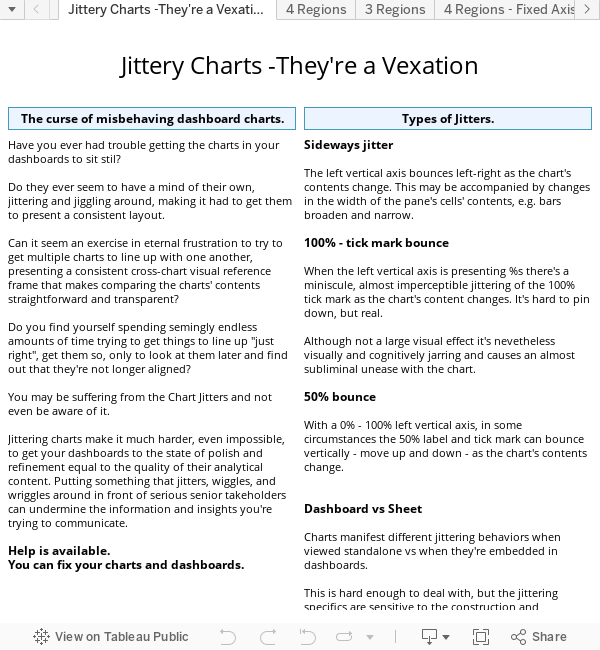
The existing menus
As seen on the left below, the current Tableau v8 beta (6) Worksheet and Dashboard menus are laid out very differently in the ordering of their individual menu items.
The lack of consistency in placement of corresponding menu items makes it much harder than it needs to be to develop the spatial sense of where the options are.
This in turn makes working with Worksheets and Dashboards through the menus much more of a hunt-and-peck operation than the smooth, low-friction activity it should be.
New Users will experience this cognitive mismatch as a significant barrier to achieving comfort, and even if they're not aware of it, will feel less welcome in the Tableau environment than they could, or should.
See the Tableau Public published Workbook for a clearer presentation: here.


The improved menus
These menus have been improved primarily by aligning the same, or equivalent, items into the same location, to the degree possible.
They also bring in the "Duplicate..." item. Having the ability to duplicate the current Worksheet or Dashboard from the keyboard is very, very valuable usability feature. "Duplicate Sheet" was in the Edit menu in Tableau v6, and was mysteriously dropped for v7. It's time it came back, along with its "Duplicate Dashboard" cousin.
The Worksheet menu also includes the "Format" option. Why is wasn't there is perplexing; "Format" is a pervasive menu option, occurring in many places in Tableau, it should be here.
I'm not sure whether "Duplicate as Crosstab" sohuld remain as a first-level Worksheet menu item, or if it should be one of the options on the submenu. So I left it in.