One of the big challenges of the annual Tableau Customer Conferences is choosing which sessions to attend.
There's a wealth of really interesting offerings, far more than I can possibly take in.
Getting to the ones I must see is tricky enough, folding in the ones I really want to attend on top of these is quite a challenge.
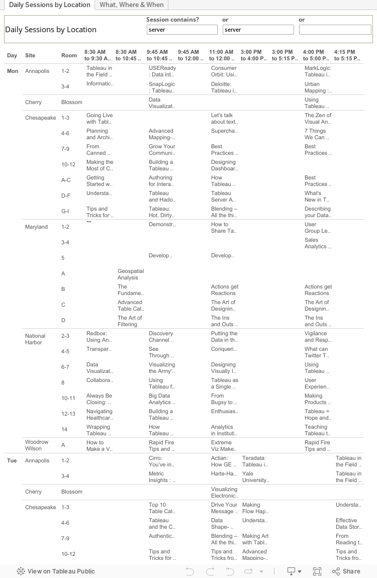
After paging up and down and back and forth on the TCC site I decided to organize the offerings a more manageable form, so I scraped the content and used Tableau to look at it.
The Tableau Public-published worksheet below can help find what you want to see, where and when it's happening, and to plan your TCC 2013 experience.
This post contemplates what it would take to add the flexibility to Tableau to enable the presentation of a data visualization in a form more familiar to many people, one that's arguably more effective at conveying the context for the quantities being presented.
It advances the thinking about how Tableau's analytical frame for data presentation can be evolved to meet requirements outside of its original design space. Examples of prior work in this area can be found in this blog's previous post here and in Tableau's Idea forum here.
Specifically, we contemplate the case where a standard Tableau table is presented as a folded-row table, which has been a standard report layout for many years.
A standard Tableau table.
This is a standard table that Tableau creates when the relevant Dimensions and Measures are selected.
The maxi-block organizational structure (illustrated below) is simple, regular and technically straightforward to implement.
Alternate table presentation – folded rows..
This is the same table as the Tableau standard, excepting that each of the subordinate Dimension members is placed just under and offset slightly to the right of its superordinate Dimension's member. This provides the visual nesting effect that people are accustomed to with data presented in this form, and which works very well for recognizing and interpreting the Dimensional relationships.
This rendition of the table is an image created with Tableau Desktop's menu: "Worksheet | Copy | Image..."
Background
In all but the simplest cases Tableau's analytical space consists of a 2D matrix with discrete elements, usually Dimensions, forming a perimeter surrounding and defining the tabular space whose individual cells contain the core data, normally quantitative, being visualized as digits, bars, lines, shapes, text, etc. Tableau generates the discrete element frames in response to the placement of field pills on the Rows and Columns shelves. The principal frames are placed on the left for Rows pills, and on the top and bottom for Columns pills. There are no right side frames.
Building Tableau's analytical space around the framing structure was a reasonable choice when Tableau was created, making it straightforward to implement the objects and actions involved in presenting data in context.
As a simple, stable platform upon which the analytical functions could be built it didn't require the design and implementation efforts a more flexible model would have required, which is always a consideration early in the life of new software. (it shares a 'simple beginnings' origin with the Tableau dashboard layout manager, but that's another story)
It was a good canvas for the basic exploratory analytical operations that are Tableau's heart and soul, and that provided the foundation for Tableau's successful disruption of the business data analysis—aka Business Intelligence—space that was dominated by big, heavyweight tools that actively impeded effective, agile, rapid data analysis.
On the other hand, the frame's simple structure and inflexibility inhibits Tableau's appeal to wider audiences. People who are used to other presentation schemes find Tableau's a barrier that needlessly hinders their ability to see their data in ways that work best for them.
The frame's main problem is that it enforces a single rigid structure that doesn't accommodate alternative presentations that are attractive, meaningful, and valuable to people, and that are more effective in communicating the data being presented.
Some of these shortcomings can be overcome with techniques that trick Tableau into a desired effect, e.g.
one popular example uses a combination of a calculated field, overloading the discrete fields , and header hiding to present a single Columns Dimension's members in the top rather than the bottom frame.
Others include
this,
this, and
this.
Tricks and techniques that take advantage of side effects achieve a singular purpose and can in a narrow sense be thought of as all fine and good, but they're hacks that actively detract from Tableau's basic value proposition of making data analysis simple and easy. Put another way, the analytics Tableau creates can also be created with the application of special technical knowledge using other technologies, and if Tableau makes it difficult to achieve reasonable outcomes the point at which Tableau loses its advantage is closer than it should be.
Showing is better than telling.
It's all well and good to talk about better ways to present data, but skeptics (and there are some) dismiss the notion that Tableau's model needs improvement. So here's an example of how some adjustments to Tableau's organization of the presentation model can produce an alternative display from the same data. As we'll see there is a simple series of smooth translations that, when invoked, provide an alternate presentation that is structurally identical to the current rigid frame model. This demonstrates that providing presentation flexibility is achievable without disrupting Tableau's basic structural model, and therefore implementing the flexibility should be relatively straightforward, should Tableau choose to do so.
The Tableau Table Structure
In order to lay out how the Tableau table can be seamlessly transformed into the desired layout we first need to lay out the table's structure so that the transformations can be presented.
Image created with "Worksheet | Copy | Image..."
The table rendered in SVG.
Recreating the table in SVG table provides a model that's easy to manipulate and show the transformations required to archive the alternate structure.
SVG is a standard Web component and is increasingly employed for graphics rendering by the emerging Web-native data analysis technologies. SVG is amenable to manipulation, programmatic and manual, which makes it highly likely that it will be a core technology employed for data analysis as the tools and technologies evolve.
Transforming the table.
The following diagram sequence shows how the standard Tableau table can be reorganized into the folder-row form via a series of simple steps. The transformation preserves the Table's data semantic structure in the same sense that transforming a donut into a coffee mug preserves the donut's basic form.
The table's analytical structure.
This diagram has separated the table's elements and added the linkages between them to show the structural relationships between the elements.
The hierarchical relationship from Ship Mode to Customer Segment to Container is clearly visible, as is the association of the individual measure values to the individual Container nodes.
Note that the Ship Mode and Container nodes span all of their descendant nodes. This is a key design element that makes this structure easy to implement but limits its flexibility.
Normalizing the structure's data elements.
In this diagram all of the elements in each row have been normalized so that all the data elements have the same height and all of the elements in a column have the same width.
This emphasizes the hierarchical model of the information structure, and makes it easier to see the hierarchical relationships and place the individual numbers in context. When scanning, one's eyes are lead more naturally to the identity (name) of the linked elements – the visual dominance of the large blocks is removed.
Folding the Dimensions – Preparation
There are two steps shown here.
The connections between the Dimensions' elements are
changed
from:
parent/right—child/left
to:
parent/bottom—child/left
The dimensional child nodes are shifted vertically so that they're below their parent's node. This creates the classic tree stair-step layout.
Note that the measure nodes continue to be horizontally in line with their 'owning' Dimension node.
With these transformations in hand, the rest is refinement of the presentation parameters, in a close analog to normal web CSS styling.
Folding the Dimensions – Stacking
The Dimension nodes have been shifted leftwards to place then each slightly offset to the right from their parent's left edge.
From here, the information layout model is transformed into the form needed. All that remains is cleanup and formatting.
Outline removal.
The information model's structural borders and connections have been removed.
We can now see the 'pure' information organized into the form we're after.
Almost there, only a couple of steps remain.
Unformatting and snugging up.
The elements' coloring has been removed, and their spacing has been adjusted so that they are visually grouped into related clusters making it easier to see them in context with their neighbors.
It must be pointed out that this visual grouping is not available in Tableau as of version 8. Given Tableau's layout model the need for and value of it isn't apparent since it's not within the product's design horizons.
Decorating.
Decorative elements have been applied to the table to assist in its interpretation.
Note that Tableau does not at present accomodate this decoration. Some of these elements are not relevant to Tableau's current presentation design, while others such as the border around the entire table are, and their absence is an ongoing mystery.
What about –Real– visualizations?
There are people who think that tables aren't legitimate data visualizations, and to whom reorganizing tables might be appropriate for reporting tools, but has little applicability for the type of real data visualizations that Tableau's used for.
They're wrong.
Same data – bar chart.
As is clearly evident here, visualizing the data as bars in the reorganized form provides at least the same level of benefits in improved clarity and comprehensibility as was achieved with the table of numbers.
It might even be the case that the potential for added value is even greater with this form. For example, it feels like using the space to the right of the Dimensions parent members for presenting measure aggregations at that level would be very useful.