Finally, you can put your labels where you want them.
In this post I'll show how to adapt the mechanism in this previous Hack Anatomy post—Hack Anatomy: Right-Aligning Bar Chart Labels—to provide complete flexibility in positioning a bar chart's labels, and in getting the presentation you want.
If this explanation seems a bit complicated, don't worry—it is.
It's also typical of the way one goes about getting Tableau to do things that aren't in its up-front abilities.
Positioning your labels.
Positioning and presenting your labels your way, as described here, relies upon two basic principles:
-
Using a secondary axis field to position the labels.
This field can be as simple or as complex as you need, sometimes a constant value works.
Sometimes you'll need to accommodate any possible inputs and so use Tableau Calculations to calculate it, this is the approach described here.
-
Synchronizing the chart's axes and, if necessary, using a fixed range for them.
Leaving the axes set to 'Automatic' is the most flexible, and guarantees that your labels will always be visible (Tableau makes room for them).
However, Tableau's alignment often get a little wobbly when left to juggle labels in the space it automatically provides for them, so setting the axes to a fixed range often results in better labels presentation.
It's unfortunate that Tableau doesn't permit more flexibility in automatic axis sizing—this would be very helpful.
Shown below are the results of applying a modification of Jonathan Drummey's use of the WINDOW_MAX() table calculation to generate a data value used on a secondary axis (hidden here) to provide a partner mark (also hidden here) for each bar whose label (shown here) is the bar's value.
First Step: adding controllable label positioning.
These examples are based on Jonathan's insight to use a second axis to position the bars' labels. The full description of the extensions are below.
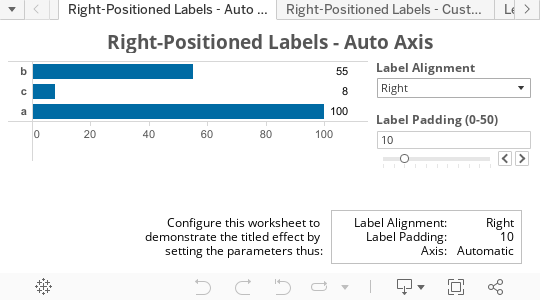
Right-positioned labels.
See the previous Hack Anatomy post for the description of the WINDOW_MAX()-based method of label placement.
In this example a padding amount is added to WINDOW_MAX(). The padding is user-configurable via a parameter.
Left-positioned labels.
This example places the labels to the left of the bars by using a negative value for the secondary axis measure.
The label positioning mechanism has been extended with a parameter that permits the user to select whether the labels are to be left- or right-positioned.

These examples put the labels in the right position—Tableau's intrinsic label positioning mechanisms adjust the chart's axes to accommodate the labels within the chart's body, but their presentation is rough. Tableau doesn't fully address all of the visual properties involved in label presentation. For example:
in the Right-Positioned example the labels are right-aligned with each other; this is a happy outcome that just happens to work out the way we want it;
in the Left-Positioned example the individual labels aren't vertically aligned in any apparently consistent manner.
A future post will cover the properties of label placement and alignment, and suggest ways in which Tableau can support them. This turns out to be a subtle and complex topic, with deeper consequences than are at first apparent.
Next Step: fine tuning the labels' presentation.
The examples below adjust the previous charts. The major difference is that the chart's axes are now fixed to values that optimize the labels' presentation. This is less flexible but aesthetically more pleasing than when the axes are dynamic and responsive to the bars' values.
Right-positioned labels.
The labels are positioned, and the axis values are set, to provide an optimal amount of space between the bars, the labels, and the chart's right border.
Left-positioned labels.
See the note above.
In this example the labels are tidly placed to the left of the bars, aligned vertically, with enough space on either side for clarity in reading them but no so much that it visually disconnects the bars from their dimension member, e.g. 'a', 'b', or 'c'..
Label positioning in action.
The demo workbook.
This Tableau Public-published workbook shows this approach to label presentation live and in real time.
It contains four dashboards, each containing one of the four worksheets shown above. Instructions are in the dashboards for configuring "Label Alignment" and "Label Padding (0-50)" to create the alignment named in the dashboard's title.
You can use it to try out different combinations of Left/Right orientation and padding values to see how they work.
It's also a good idea to download it and look into it. There are things in Tableau that affect the label presentation that aren't amenable to automation, and that aren't' accessible except through the Tableau Desktop UI (and maybe via web editing, but I haven't checked that yet).
Anatomy of the Hack.
The examples above show labels that meet our aesthetic expectations. You should be able to obtain quality results for your own labeling.
It might take some experimenting to find a combination the value of the data field used on the second axis, and the specific configuration of the axes that nudges Tableau into putting the labels just so.
I built the parameters-based workbook to provide the dynamic flexibility to try out various positioning combinations. There's no way I know of to parameterize axis behavior, and I don't think one exists. My suggestion is that you take this model and experiment with your own labels. Once you find a good configuration you may not need to use a Table Calculation for your secondary axis field, but can use a simple constant. This would be simpler, easier to understand later on, even if you comment your field calculations diligently, and less computationally expensive.
Caveats.
Yes, there are caveats.
Although it's possible to get good results, as shown above, label presentation is subject to elements I haven't covered that Tableau takes into account when determining exactly how to present the labels.
Since this is really a Hack Anatomy series post I'm deferring the full and detailed description of Tableau's label presentation mechanisms, all of the Tableau bits that affect the label presentation. It gets fairly twisty pretty quickly and needs attention as a separate topic.
Still, it wouldn't be nice to drop you cold like that, so here are the highlights, the major things that Tableau considers in presenting labels:
-
The mark's position.
This post covers this fairly well, I think.
-
The mark's label configuration, implicitly or explicitly via the Marks card.
Label alignment is the dominant property, but 'alignment' might not mean what you think it means.
-
The mark's size.
Big, fat marks take up space that their labels may not be allowed to impinge upon.
-
The mark's axis—Tableau expands axes to accomodate labels when necessary, but its algorithm for doing so ends up providing irregular results.
That's all, folks. I hope you found this informative and useful.