
Note: this post is a work in progress.
This session delves into the workings behind the solution to this Tableau Community request for assistance: Showing maximum and minimum with a calculated moving average. Please refer to the Tableau Community posting for the full details.
In the post the person asking for help explained that she was looking to have a chart like this:

and described her goal thus:
One of Tableau's Technical Support Specialists—community page here,
provided a workbook containing a solution; it's attached to the original post.
She also provided a step-by-step recipe for building the solution worksheet. Cosmetic adjustments to the solution to make it easier to identify and track the Tableau elements have been made.

The blue lines identify the parts and something of the relationships between them. The complexity of the parts and their relationships is difficult for inexperienced people to wrap their heads around.
This post expands upon the solution by looking behind the curtain, showing the Tableau mechanisms employed—what they do and how they work. It does this by providing a Tableau workbook, an annotated set of diagrams showing how the worksheets' parts relate to one another, and explanatory information.

The rest of this post lays out the Tableau mechanisms, how they work, and by extension how they can be understood and assimilated so they can become tools in one's Tableau toolbox, available for use when the needs and opportunities arise.
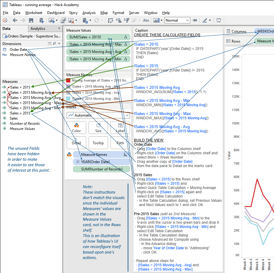
– The green arrows indicate record-level calculated fields
– The red arrows indicate Tableau Calculation fields
– The thin blue lines show how fields are moved
The following
Although the Public Workbook above implements the solution and is annotated with descriptive information it doesn't go very deep in surfacing and explaining the Tableau mechanisms being taken advantage of—how they work and deliver the results we're looking to achieve. This section lifts Tableau's skirts, revealing the behind the scenes goings on.
One of the things that can be difficult to wrap one's head around is Tableau's mechanisms for accessing and processing data, from the underlying data source through to the final presentation.
Tableau processes data in (largely) sequential stages, each operating upon the its predecessor's data and performing some operations upon it.
This solution employs multiple stages; this section lays out their basics, illustrating how they're employed to good effect.
Tableau applies different data processes and operations at different stages—in general, corresponding to the different 'kind' of things that are present in the UI. These stages are largely invisible to the casual user, and their presence can be difficult to detect, but understanding them is critical to being able to understand how Tableau works well enough to generate solutions to novel situations.
At the core of the solution is the distinction between data structure and presentation. In this situation there are, in effect, two data layers in play;
we represent the stages as layers in order to help visualize them.
The basic ideas are: when displaying data Tableau will only present Marks for non-Null values; and Table Calculations can be used to selectively instantiate values in different layers. The underlying layer is where the data is stored upon retrieval from the database. The surface layer is where presents selected data from the underlying layer to the user. The key to this solution is that Tableau only presents some of the underlying layer's data—that required to show the user what s/he's asking to see.
This Workbook contains a series of Worksheets that demonstrate these Tableau mechanisms.
This Worksheets are shown below, along with descriptions of what's going on.
Download the Workbook to follow along.
!Sales = 2015
 IF DATEPART('year',[Order Date])=2015
 THEN [Sales]
 END

!Sales = 2015 (Null)
 IF DATEPART('year',[Order Date])=2015
 THEN [Sales]
 ELSE NULL
 END

!Sales = 2015 (0)
 IF DATEPART('year',[Order Date])=2015
 THEN [Sales]
 ELSE 0
 END

The major difference between the fields is whether they evaluate to Null or 0 (zero) when Order Date's Year is not 2015. The first two fields evaluate to Null—the first implicitly, the second explicitly. The third evaluates to 0.
This is the distinction upon which the solution's deep functionality depends. Recall that Tableau only presents non-Null data; this solution takes advantage of this by selectively constructing the Null and non-Null presentation Measures we need.
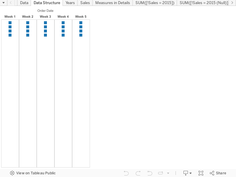
This viz shows the basic data structure needed to support our goal of comparing Weekly Moving Averages for each of the Order Date Years:
- there are columns for each Week (filtered here to #s 1-5); and
- each week has 'slots' for each of the four Order Date Years.

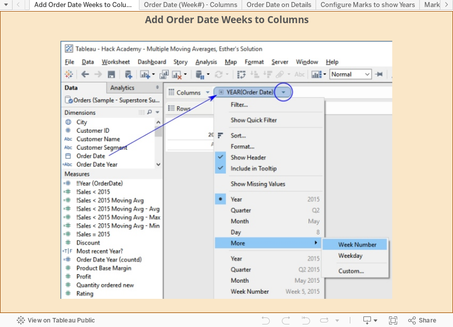
Right-clicking Year (Order Date) in the Marks card and selecting "Label" tells Tableau to show the Year for each Mark.
This confirms the data structure, and is one of the basic steps in building complex visualizations.

In this viz Sales has been added to the Marks card—Tableau applies its default SUM aggregation and configured to be used as the Marks' labels.
As shown, Tableau uses the Sales sum for each Year and Week as the label.
This can be confirmed to show the accurate values, if desired, via alternate analyses.
Note that the viz shows the actual Year & Week Tales totals, not the Sales compared to the same Week in 2015.

In this viz Sales has been replaced on the Marks card by the three Measures shown.
Our objective is to see how Tableau presents each of them vis-a-vis the base data structure.

SUM(!Sales = 2015) has been used as the Marks' label. As we can clearly see, there's only one Mark presented for each Week. One may wonder: why is only one Mark shown for each week when we know from above that there are four Years with Sales data for each?
In this case, Tableau is only presenting the Marks for the non-Null measures in each Year/Week cell,
because the !Sales = 2015 calculation
   IF DATEPART('year',[Order Date])=2015

   THEN [Sales]

   END
One potential source of confusion is that the "Null if Year <> 2015" result for the !Sales = 2015 calculation is implicit, i.e. Tableau provides the Null result by default in the absence of a positive assignment of a value when the Year is not 2015.

This viz has the same outcome as the one above.
The difference is that the calculation for
   IF DATEPART('year',[Order Date])=2015

   THEN [Sales]

   ELSE NULL

   END
Using an explicit NULL assignment is advised as it minimizes the cognitive burden on whomever needs to interpret the calculation in the future.


From this point we're going to be building the viz from the bottom up, showing how the constituent parts operate and interact with each other.
First up: making sure that the Sales calculations for Sales for pre-2015 and 2015 are correct.

The moving average for 2015 Sales is generated by configuring the SUM(!Sales = 2015) measure as a Quick Table Calculation in the viz.

- Activate the SUM(!Sales = 2015) field's menu
-
Select "Quick Table Calculation", then choose "Moving Average"
Tableau will set up the standard Moving Average Table Calculation, which uses the two previous and current values as the basis for averaging.
Since this isn't what we're after, we need to edit the TC. -
Select "Edit Table Calculation" (after activating the field menu again)
Configure as shown, so that Tableau will average the Previous, current, and Next values.
Note: The meaning of "Previous Values", "current", and "Next Values" is inferred from the "Moving along: - Table (Across)" - The "Compute using" field option shows the same "Table (Across)" value as the "Moving along" option in the Edit Table Calculation dialog.
-
Add !2015 Sales back to the viz.
There are a number of ways to accomplish this—most common are dragging it from the data window, and using the Measure Names quick filter.
Why do this?
Configuring the Table Calculation in steps 1-4 changed the SUM(!Sales = 2015) field in the Measures Value shelf from a normal field to a Table Calculation field (indicated by the triangle in the field's pill). Adding SUM(!Sales = 2015) back to Measures Values provides the opportunity to use its values in illustrating how the Moving Averages are calculated.
For each Moving Average value, Tableau identifies the individual SUM(!Sales = 2015) values to be used then averages them.
The blue rectangles in the table show individual Moving Average values, pointing to the referenced "SUM(!Sales = 2015)" values.
There are three different scenarios presented:
- Week 1 — there is no Previous value, so only the current and Next values are averaged.
- Week 4 — averages the Week 3 (Previous), Week 4 (Current), and Week 5 (Next) values.
- Week 7 — there is no Next value, so only the Previous and current values are averaged.
There's no need to include SUM(!Sales = 2015) in the visualization to have the Moving Average Table Calculation work. I've added it only to make explicit how Tableau structures, accesses, and interprets the data it needs for the presentation it's being asked to deliver.
Please note: this is implemented using a persistent Calculated field coded as a Table Calculation: !Sales < 2015 Moving Avg
This is a different approach than using the in-viz configuration of the 2015 Sales shown above. There are differences in the two approaches, some obvious, some subtle.

-
Add !Sales < 2015 Moving Avg to the Measures Shelf as shown.
As mentioned above, it can be dragged in from the Data Window, or selected in the Measure Names quick filter.
When Tableau puts !Sales < 2015 Moving Avg in the viz it applies the default configuration as shown. In this viz the use of Table (Across), as shown in both the Table Calculation dialog and the field's 'Compute using' submenu, provides the desired functionality, i.e. averaging the appropriate !Sales < 2015 values, based upon the field's formula:
WINDOW_AVG(SUM([!Sales < 2015]),-1,1), resulting in:
- Week 1 — only the current and Next values are averaged.
- Week 4 — averages the Week 3 (Previous), Week 4 (Current), and Week 5 (Next) values.
- Week 7 — only the Previous and current values are averaged.
Adding the Order Date Year to Rows instructs Tableau to construct a set of the Measures for each individual Year in the Order Date data.
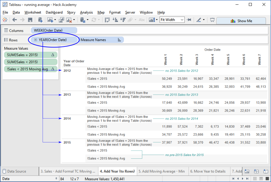
Note that the Measures are only instantiated for those Years for which they are relevant, i.e. the pre-2015 Measures only have values for the years prior to 2015, and the 2015 Moving Average only has values for 2105.
Having these Year-specific values sets the stage for the next part: identifying the Minimum, Average, and Maximum of the pre-2015 Yearly Moving Averages.
For example, as shown in the viz, these values and Min/Max for Week 1 occur thus:
2012 – 36,902 - Max
2013 – 30,669 - Min
2014 – 34,707
and the Average of the Yearly Moving Averages is: 102,278 / 3 = 34,093
How Tableau accomplishes constructing the Measures for this viz is beyond the scope of this post, and it can get complicated.

Tableau generates a value for each Week for each Year—for the Years prior to 2015.
This image has been cropped to show only 2012 & 2013.
As shown in this image, for each Year, all of the !Sales < 2015 Moving Avg - Min values is that of the minimum of the Weeks' values for !Sales < 2015 Moving Avg for that Year. This is because Tableau's default configuration for a Table Calculation Measure added to a viz is Table (Across).
In order to achieve the desired calculation - that each Week's value for !Sales < 2015 Moving Avg - Min reflect the minimum of the values for that Week for the individual Years, we need to configure !Sales < 2015 Moving Avg - Min in the viz, directing Tableau to perform the calculation in the desired manner.
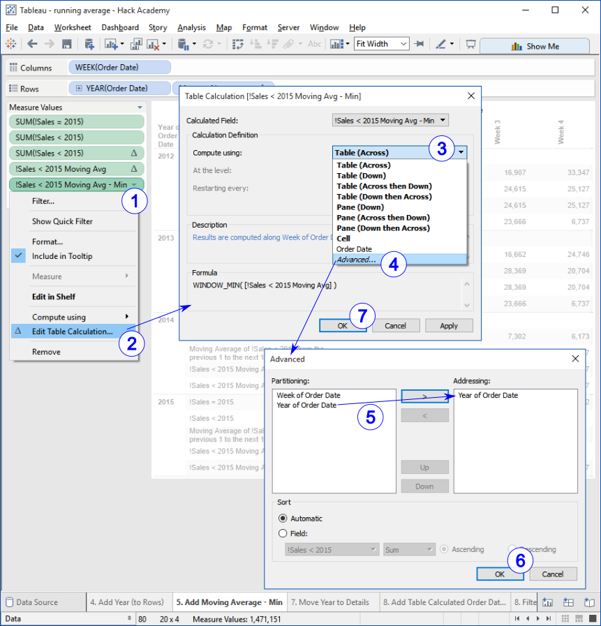
- 1..2 – operate as shown
-
3..4 – select the "Compute using: | Advanced" option
Note the active/default Table (Across) option; as explained above, this is why the default calculation finds the minimum value among the Weeks for each Year. -
5 – move "Year of Order Date" from "Partitioning:" to "Addressing:"
Partitioning and Addressing are fundamental aspects of how Tableau evaluates and calculates Table Calculations. Covering them is beyond the scope of this post.
Googling "Tableau partitioning and addressing" will lead to a robust set of references. - 6..7 – "OK" & "OK" to apply the configuration.
image